

One of the great triumphs of this new generation of traders has been its ability to “stick it to the man,” by using social media platforms like Reddit and Twitter to build the backing needed to force certain Hedge Funds to choke on massive, often debilitating short positions.
However, there’s still a large contingent of traders that likes to follow what the big guys are doing, by replicating the long positions that they’ve acquired over the prior few months.
I’m about to show you how to find what the world’s biggest investors have been investing in. In addition, we’re going to take a look at how recent positioning by the world’s greatest investor, Warren Buffet, may have been a warning sign ahead of this past week’s early selling.
Follow the money with Form 13F Filings
Under the Securities Exchange Act of 1934, as amended (the “Exchange Act”), advisers who exercise investment discretion over accounts that hold exchange-traded securities may be subject to reporting requirements as set forth in Section 13 of the Securities Exchange Act (“Section 13”). Section 13(f) requires institutional investment managers with investment discretion over $100 million or more in “Section 13(f) securities” to file quarterly reports with the SEC on Form 13F within 45 days of each quarter-end.
While these forms have been the source of inspiration for many retail investors’ trading ideas, and are loved by the financial media for their ability to generate click-worthy headlines, these reports are not without their flaws.
You can learn more about these reports and their potential flaws by clicking here.
Warren Buffett’s Berkshire biggest Q2 investment was in a defensive stock
Warren Buffett’s Berkshire Hathaway added to just three positions in the 2nd quarter, with only one of those positions being a new position (1.55 million shares of Organon) as a result of a spinoff.
Interestingly, Berkshire’s most significant addition was a 21% increase in one of its existing positions, the massive grocer Kroger Company.
This rather large percentage increase in the defensive grocery store giant comes at a time when the markets are at all-time highs, and when economic growth numbers are starting to show evidence of slowing.
And having an economy that is disjointed with the stock market is always a tricky thing to navigate.
I’m not sure where the markets are heading next but a 25% drop is highly unlikely I would say.
In fact – I have been awaiting the pullback we witnessed this past week, so I can get a buying opportunity on stocks that are discounted!
What is my plan?
I am going to continue to be cautiously bullish to neutral while I continue to search for pockets of relative strength.
Defensive stocks may not be sexy, but they are reliable
Right now, the defensive consumer staples sector, which is where grocery stores like Kroger Company call home, is showing some of the best relative strength momentum of all the S&P 500 sectors.
Companies within the S&P 500 consumer staples sector typically are not viewed as being sexy, and usually underperform the market during good times.
That’s because while they usually act as steady profit and revenue generating streams all year round, they have much lower growth rates than the companies within the consumer cyclical and tech sectors we love to trade when the economy is humming.
Here’s how to spot sectors that are starting to build relative strength
Relative Rotation Graphs are readily available on a number of charting platforms these days. Today, we’ll be using the version provided on the Stockcharts.com website.
Stockcharts.com describes RRG charts as follows: RRG® charts show you the relative strength and momentum for a group of stocks. Stocks with strong relative strength and momentum appear in the green Leading quadrant. As relative momentum fades, they typically move into the yellow weakening quadrant. If relative strength then fades, they move into the red lagging quadrant. Finally, when momentum starts to pick up again, they shift into the blue improving quadrant.
The clockwise rotation that occurs on these charts is very effective when prospective buyers of stock are trying to find the early stages of a leadership cycle, or when prospective sellers are trying to identify early signs of deterioration.
In both cases, the comparisons are made relative to some benchmark, which in many cases is the S&P 500.
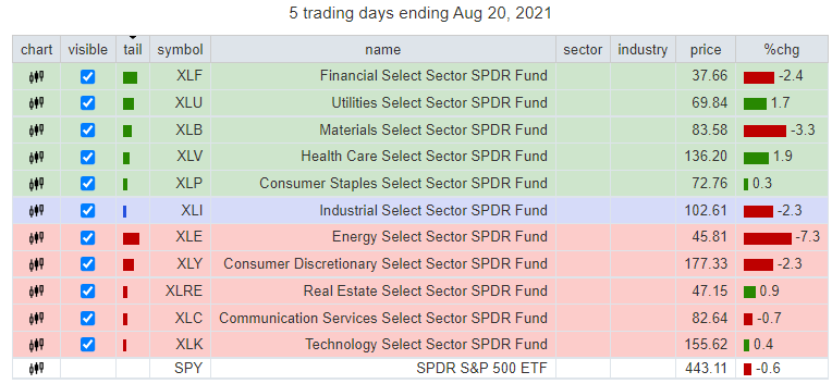
For today’s example, we’re looking at all 11 S&P 500 sector ETFs relative to the S&P 500 ETF (SPY).
Figure 1
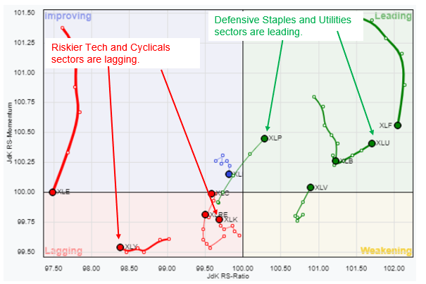
Figure 2
Though not visible on Figure 2 above, the S&P 500 ETF (SPY) is positioned at the origin (i.e., where the X and Y axis meet).
The long tails left behind by each sector are meant to help the viewer track each sector’s relative path over the past 5 days of trading.
The message that was being signaled by this graph at the end of this week’s trading was loud and clear, and that is that defensive sectors like consumer staples and utilities are now outperforming the S&P 500, while more risky sectors like tech and consumer cyclicals are lagging.
Here are two bullish ideas worth looking at in the staples sector
While the consumer staples sector has shown a recent burst of leadership over the benchmark, I want to be cautious when looking to build positions in the sector, as the early stages of leadership can sometimes be turbulent.
Therefore, I’m looking at two stocks that not only have interesting setups, but also have very well defined support that is close by.
Whether you’re buying the underlying stock or getting long by buying or selling bullish options strategies, it is always advised that you try to anchor your trade to an important area of support so that you can keep your losses small if the trend does not develop according to your original plan.
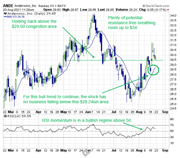
The first stock I am watching is The Andersons, Inc. ANDE.
As Figure 3 shows, I like the setup because the stock rallied on big volume as the broader market was selling off earlier this week.
In addition, the 13-day moving average, which is now sloping higher and is joining forces at the most recent pivot low of $28.24 as a fortified stopout level that I know must hold in order for the recent bullish trend characteristics to remain intact.
All as momentum has recently turned positive.
Figure 3
The next stock that looks interesting is Dollar Tree, Inc. (DLTR).
As Figure 4 shows, DLTR has developed a small “bull flag” that now has bullish smoothing support from the higher sloping 13-day moving average.
All as momentum seems to be holding on to a newly established bullish foothold.
Figure 4
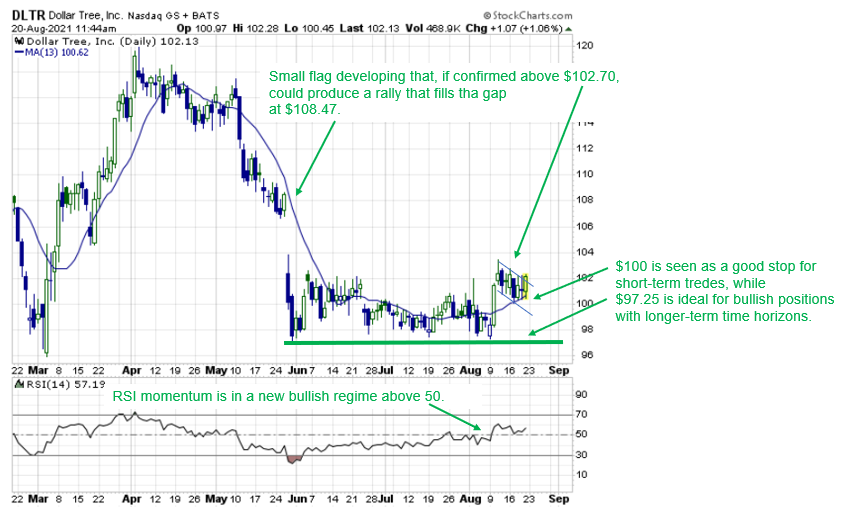
In this case, a close back below the $100 area would significantly damage this “bull flag” narrative, signaling to traders with more aggressive, shorter-dated long options positions that the case for price to push higher in a short period of time is losing credibility.
And for any traders whose plan it is to build positions with a longer-term holding period, then there is no doubt that a close back below the fortified $97.25 area would be an indication that the bullish case has broken down completely.


1 Comments
thanks I will try One of these.